The Existing Marketo Email Template Didn’t Meet their Needs.

HEAT Software had eGuides and white papers they wanted to promote, however their off-the-shelf Marketo email template seemed a little choppy in the presentation of the offer. And, it didn’t contribute to a consistent representation of the HEAT Software brand as it was presented on their website.
Their existing Marketo template also was not programmed to be mobile responsive, which they were sure was suppressing their response rates. They tasked Beasley Direct and Online Marketing, Inc., to re-design their Marketo template for a better brand presentation and mobile responsive design.

The original Marketo email template.
Re-Designing the Email Template for Mobile Responsive Design
Our new creative strived to solve several problems at once:
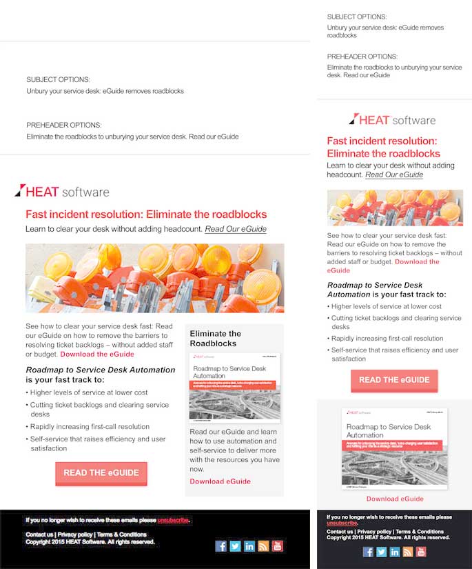
- We introduced better use of subject line and pre-header copy.
- A new hero image style was suggested, to be eye-catching but not so large that the size would be an obstacle to reading the copy in Outlook if images are blocked.
- The new email format was mobile-responsive and designed to be easy to skim and respond. The desktop was 700 pixels wide to fit nicely on any desktop, and re-sized to 320 pixels, and shifted the right column down on mobile.
- Copy direction drove readers to each offer, and multiple clickable graphics and text links to get the downloadable eGuide or white paper offer.
- The overall structure used the HEAT Software brand’s distinctive red color in a consistent manner across emails and their landing pages.
The new Marketo email template in both desktop
and mobile sizes.
Template Design and Blocked Images
We also made sure that the headline was HTML text, and in fact all of the copy on the email is HTML text, so it can be viewed in Outlook when images are blocked. It’s tempting to think that if you’re designing your emails to be mobile responsive, you’ve solved all of your email creative problems. However, when you’re doing B2B email marketing you still have to worry about one thing: Outlook. Outlook blocks images by default. So if your email is primarily images or text within images, it won’t be readable until someone downloads the images — which will be a small percentage of people as they’re skimming emails.
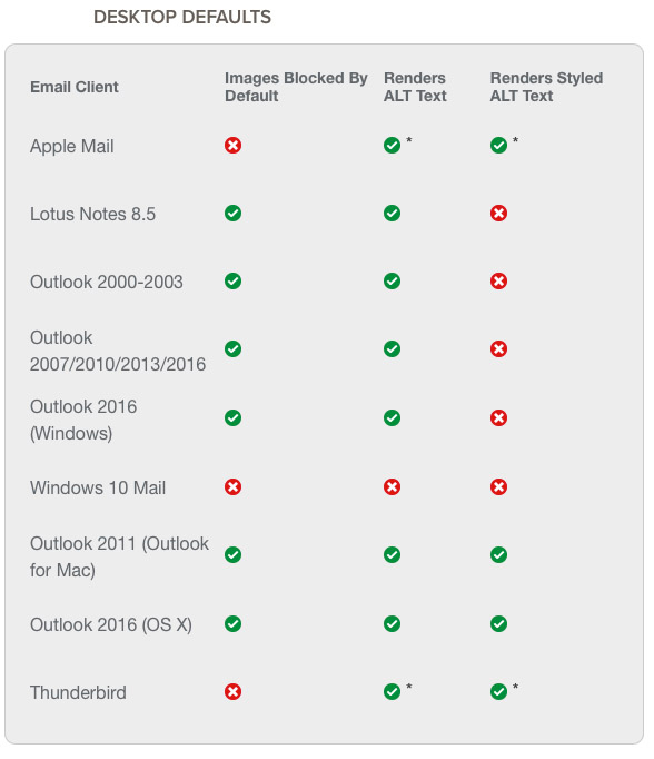
Images are blocked by default on Outlook, which is the browser a high proportion of B2B emails will be viewed on.
Source: The Ultimate Guide to Email Image Blocking, by Lauren Smith
To be compatible with Outlook, we suggest you use images to complement your copy and add visual interest to the email, but make them small enough so it is not blocking the ability of your reader to see the text with images off.
The Registration and Thank You Pages Carried the Visual Theme Through to the End
The registration page was designed to carry the same visual theme as the email, so no one would feel visually lost when they landed on it. It quickly repeated the eGuide offer and benefit for reading it. The registration page was designed to keep the registration fields within the first scroll on mobile. You’ll notice that the benefit copy shifted to the bottom of the mobile email. We did this using @media commands, to keep the registration fields up high on someone’s phone, and the benefit copy was there if they wanted to scroll down to learn more.
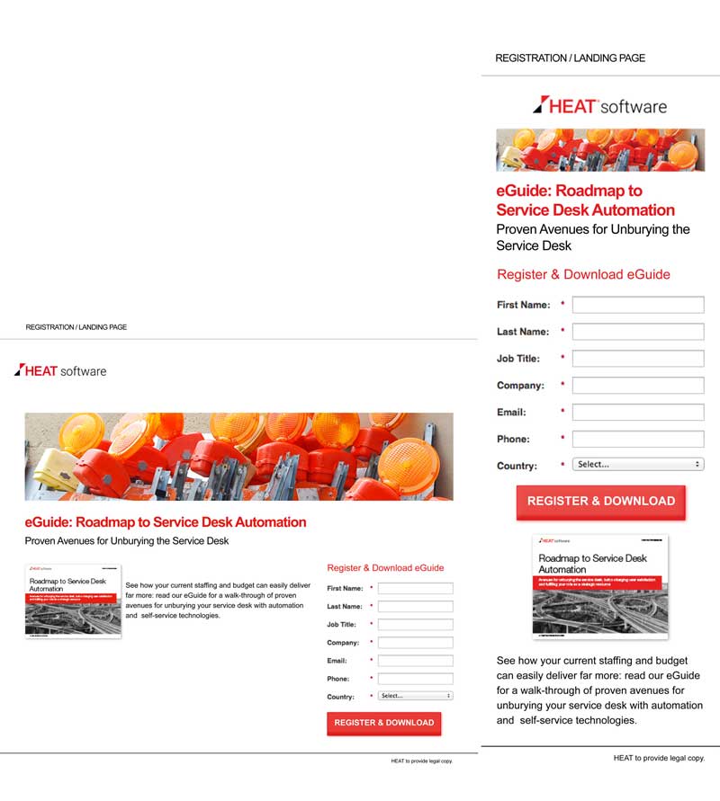
The new Marketo registration page in both desktop and mobile sizes.
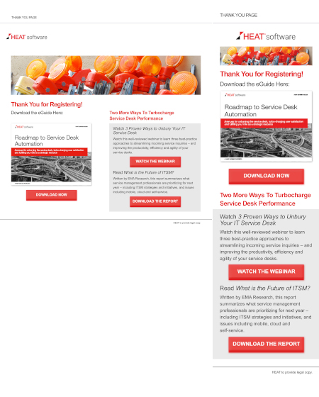
The Thank You Page
The Thank You page carried the same visual theme through to the end, and made it easy to download the requested asset. It also used some extra real estate next to the primary asset to offer two related other assets: a webinar and a report. By using the grey shading behind the two extra assets, it was easy to see that they are separate from the main offer. The Thank You page re-sizes beautifully on mobile.
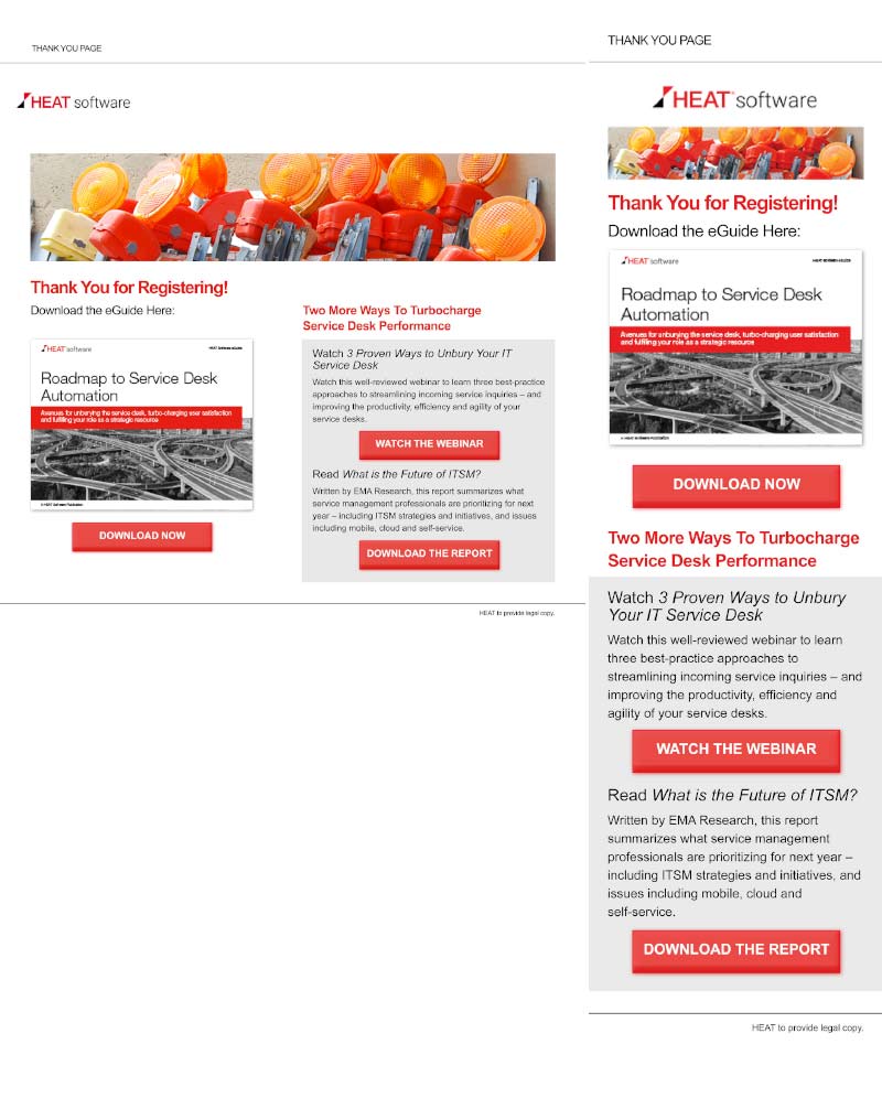
The new Marketo Thank You page in both desktop and mobile sizes.
Best Practices and Successful Results
By incorporating all of our best practices into the new mobile, responsive templates, HEAT Software had a great foundation for their lead generation campaigns. The templates were easy to replace text and images, which allowed for quick creation of new campaigns in their Marketo marketing automation system.
If you need help with re-designing your Marketo email templates, we can help. We research and design high-converting custom email templates. Contact us for a free consultation!
The Author

Founder and President, Beasley Direct and Online Marketing, Inc.
Chair, DMAnc