Email nurture may be coming “full circle”
I remember the first time as a young marketing manager at a software company in the 1980’s we were given an email account to communicate with our co-workers. It was text only, kludgey, and the very foundation of email inbox systems we use today. The first email sending platforms in the 1990s only allowed text emails, and in those days email marketing often had 50-75% click-through rates. That seemed like the golden age of email marketing from a response and simplicity standpoint. Emails were easy to set up. Copy was clean and clear. We’ve come a long way since then by adding images, personalization, and dynamic content to emails. But, with the complexity we may have taken away from clean design and clarity of message. However, we may be coming “full circle,” returning to a simpler, cleaner and more text oriented design for email nurture. We’ll explore the reasons why in this article.
Simpler may be better…for a lot of reasons
The trend back to a more text-oriented design for emails started a couple of years ago, but I’ve noticed it gain huge momentum in the past six months. There a number of possible reasons for this. Text emails are:
- Mobile compatible (not a lot of big images taking up viewport area)
- Fast to execute
- Feel authentic (like a real person is writing/sending them)
- Easy for a busy person to get through
Huge proponents of these types of emails are Ann Handley, of Marketing Profs, Ryan Deiss of Digital Marketer, and even LinkedIn and Marketo have gotten into the swing. Check out the latest nurture email I just received from LinkedIn this week. Very simple text explaining new company page features. It has a text link with no button! They leave the images and video out of the email and put them on a very well done landing page.
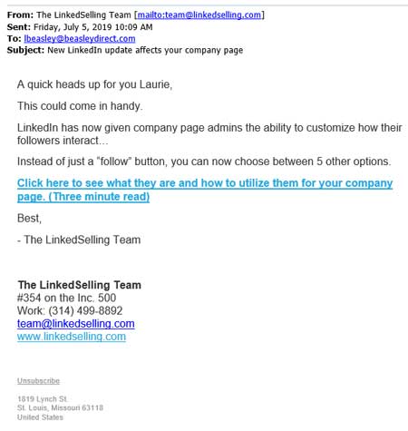
Example text email nurture from LinkedIn. All text, no logo, and no buttons.
The biggest motivation might be mobile
Designing emails for mobile compatibility can be a huge struggle to get everything you want to say in the first view/scroll area. Big images, or any images for that matter, can push your main message too far down and get in the way of what you’re trying to accomplish with nurture messaging. That’s why I think many brands are moving away from images, big logos and big buttons on their nurtures and moving to a more text-oriented, clean approach to email design. That approach looks great on desktop and mobile.
Less to program means faster to execute
A text oriented email means you have less to program. You don’t have to over-engineer the email with responsive design and @media commands. It can be a single-column, albeit narrower mobile aware design done in simple HTML or a template that almost anyone in the marketing department can manage.
Text feels more authentic
There is a big push in marketing for brands to feel more authentic to their customers. There’s nothing more authentic than a personal note or letter. Many marketers are having their email nurtures signed by assigned account reps and if their name is going on it, it better feel like it’s coming from them with a more personal note rather than a splashy promotional email.
Text emails are easy for the reader to get through
The competition for eyes and readership in the inbox is huge. You’re better off if you’re known as the brand that “gets to the point fast.” Or at least fast and in an interesting way. Ann Handley of Marketing Profs writes very entertaining emails, but more than that she gets her point across fast without a lot of visual hoopla. So if you’re cruising through your inbox and want to see the latest course details or find out what’s on Ann’s ever curious mind, boom you can usually get through her emails in 5 to 10 seconds.
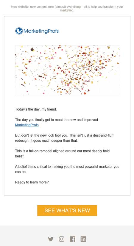
MarketingProfs emails are clean, simple and easy to get through.
Even the big boys, like Marketo, are thinking that simple text is better. Check out this email nurture example. It’s an invite to a webinar on artificial intelligence and personalization. They chose good old, simple text to get this invite out the door. Not much foo-foo in this email. And honestly, I didn’t need more than what they put in that one sentence to know whether I wanted to attend the webinar. We were both served well by the simplicity and brevity.

Marketo chose a very simple text email note to promote an upcoming webinar.
Less is more…response
The return to text email style is supported by the fact that even outside of marketing, workers are struggling to simplify communications with popular productivity tools like Slack that are simple text-oriented communications. Going back to our email roots may also revive our response rates. If our email readers know that they can get the stuff they need quickly and easily from our emails, then they may be more likely to open them. This is being tested by many, and I believe will bear out meaningful results in increasing open and click-through rates. And in the words of the poet Robert Browning, “less is more.”
Is your email marketing nurture campaign failing? Our email marketing team can help. Contact us now.
By Laurie Beasley, Co-Founder and President, Beasley Direct and Online Marketing, Inc.