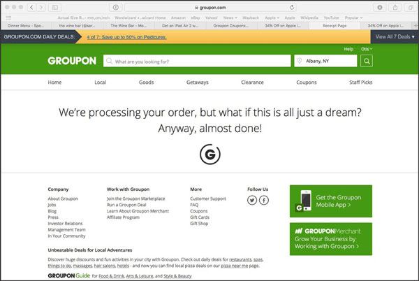
Confirmation Page and Thank You Page Optimization.
Success! Your prospect has completed the registration form and hit “I want it”, and checked out of the shopping cart or taken some other desired action. But your job’s not quite done. You need to acknowledge their response and often deliver a pdf document or other offer you promised with a confirmation page. Even if no further action seems appropriate, you still need to give the prospect positive feedback to confirm their response has been entered in your system.
At our agency we used to fulfill pdfs with a download link right from the thank-you page. Then we realized that a confirmation email is better because it provides another touch point and makes sure the recipient provides a legitimate email address. So the thank you page recognizes the registration and tells them to check their email for the download link. (Under some circumstances we’ll include a download link on the thank you page as well.)

Additional Confirmation Page Design Tips
Furthermore, there are a couple of other useful things you can do with confirmation page design. Keep in mind your reader has already taken the desired action, so any further interaction is a bonus. You can:
- Provide links to other relevant content and pages on your website.
- Include a plug for your organization and its services (since up to now you’ve been 100% focused on the offer, right)?
- Additionally, include a bit of teaser content from your info premium for immediate gratification. (Doing this allows you to promise, on your landing page, that registration brings IMMEDIATE access to some of the great tips you want to share.)
Lastly, you can also use the thank you page to provide a “share this offer with a friend/colleague” link. And, include sharing links for social media. Your prospect may never feel so favorable about you again. So, strike when the iron is hot!
Read more about landing page design here.
The Author

Founder and President, Beasley Direct and Online Marketing, Inc.
Chair, DMAnc.org


