Redesigning the Template for a Cleaner, Mobile Aware and Mobile Responsive Email Design.
A company which makes Product Management software asked us to help them re-design their email template. Their old template felt to them like it wasn’t organized well with several separate, disparate sections. It also didn’t follow mobile aware and mobile responsive email marketing best practices. We wanted to modify the template to do the following.
- Show off their clean brand identity.
- Make sure the imagery would appeal to their target audience.
- Re-design the template to be more compatible with desktop and mobile viewing.
- And, simplify the design to bring the reader down through the email.

Making the New Template Compatible with Multiple Email Browsers
Designing an email is much more complicated than designing a web page if you’re trying to make it effective on as many email browsers as possible. With a web page you only need to worry about five major internet browsers. For emails you have to worry about the display on over 13 email browsers.
This is the first thing we wanted our client to remember
In the desire to have a mobile aware and mobile responsive email, you should not forget about optimizing for desktop browsers. Especially if you’re mailing to B2B prospects like they were. Emails viewed on smartphones experience significantly less conversions than emails viewed on the desktop. We theorize that folks skim emails on mobile and actually read the emails on desktop. Therefore, they may be induced to click or buy when they read the value proposition more thoroughly.
Here’s the second thing to remember
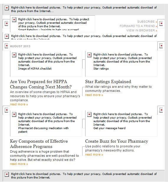
Some desktop browsers block images by default. Including Outlook, web viewers such as Yahoo!, and mobile viewers such as Android. So if your email has multiple images in it and the recipient hasn’t manually downloaded them, they will not be seen. There will be white boxes with alt tags replacing images, just like the email example below. We don’t feel an email can be effective if the offer is obscured mostly in white boxes. Further, after optimizing client email for all browsers, including Outlook, removing and/or repositioning images, they’ve consistently seen a 1-3% increase in click through.
Should I Optimize for Outlook?
Some may wonder if Outlook is that prevalent any more. It has certainly seen a falloff in the percentage of email viewers since the introduction of smartphones. However, Outlook still has around 8% of all email views and a significant percentage of B2B viewers reading their emails on their desktops at work.
According to Litmus, the list below shows the top ten email clients. Apple iPhone, Gmail, and Apple iPad hold the top three spots. However, Outlook, Outlook.com, Yahoo!, and Android devices (all which block images by default) is 21.3% of all email readership . You certainly should want to optimize your emails for that high a percentage of email viewers!
- Apple iPhone: 33.0%
- Gmail: 15.8%
- Apple iPad: 11.6%
- Android: 10.3%
- Apple Mail: 7.6%
- Outlook: 6.7%
- Yahoo! Mail: 3.0%
- Outlook.com: 2.1%
- Windows Live Mail: 1.3%
- Thunderbird: 0.7%
Making the New Mobile Aware and Mobile Responsive Email Template
Our client was concerned about making their emails look good on mobile. The reason: the high percentage of emails viewed on smartphones today, per the chart above. There are two methods for making emails mobile optimized: Mobile Aware and Responsive Design.
Mobile Aware is when you make simple improvements in the design to make sure it renders well on mobile. This means starting off with a narrower email, larger text, and larger buttons so that when they shrink down to a smartphone, the screen still looks good.
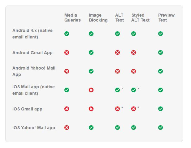
Mobile Responsive Email Design is when you deliver a customized mobile experience with special design and code using media queries. Beware, not all mobile email browsers support media queries, as the chart below shows.
Mobile Aware and Mobile Responsive Email Design for Pardot
For our Product Management client, we wanted to make the email template as easy for multiple worldwide marketing managers to use in their Pardot system (part of the Salesforce Marketing Cloud) as possible. This meant weighing the tradeoffs of the simplicity of Mobile Aware design versus the complexity of Responsive design. We didn’t anticipate the need for re-stacking of columns or eliminating elements that a typical eCommerce email might require.
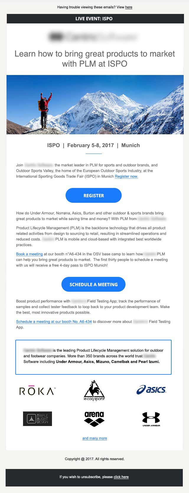
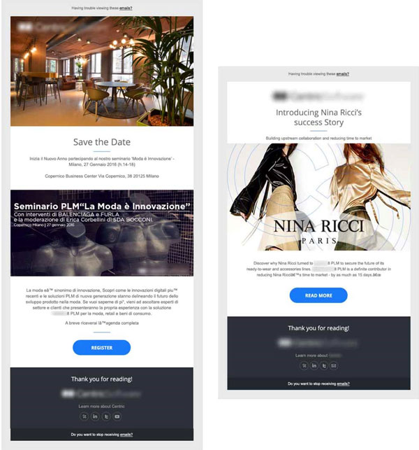
This template is an event invitation, so the design didn’t need to support complex content areas. So we chose to make the new design Mobile Aware with a single column layout, making editing and testing as easy as possible. In Mobile Aware the email tends to start off narrower (about 600 pixels, vs. a 900- to 1200-pixel wide standard email design). And, it has large enough fonts and buttons so that when it scales down to a smartphone it is still very readable.
Mobile Aware Design on Devices
On desktop or laptop computers, Mobile Aware emails still fill the majority of the viewing pane and are easy to read. On tablet and mobile devices, the 600-pixel wide Mobile-scales down slightly. This is because the design anticipates the need for larger buttons and fonts. The elements are still readable and the design provides a comfortable user experience.
We also wanted to make sure that the headline was readable whether images were blocked or not, and so we moved the headline to the top. You’ll see that we made the image take up less vertical space than their original email template This allowed room for more information on the event. By using a thoughtful approach to image selection and cropping, the new size saved space while supporting the message to the audience.
The Call-to-Action (CTA)
We also made sure there were Call-To-Action (CTA) buttons in several locations in the email as someone would scroll down. We’ve observed that mobile email readers tend to click on links at the top and bottom of emails more than the middle ones. You need to be sure that actions are possible all through the email.
How to Present the Company Overview
We created a section in a box at the base of the body area to support and set apart a brief overview about the company. This allowed a reader to easily learn more without interrupting the main email message.
The Winning Results
In conclusion, by implementing mobile aware and mobile responsive email best practices we were able to create a new template worldwide marketing managers could easily use. As a result, they saved time in the creation of new email programs. By making sure all copy is scaled to be readable and images are sized appropriately for the mobile environment, we were able to improve the prospect reader’s experience. Thus, making it easier for them to register for the event.
Read more about leveraging email campaigns with direct mail here.
The Author

Founder and President, Beasley Direct and Online Marketing, Inc.
Chair, DMAnc