Your DM (Direct Mail) outer envelope is the first (sadly, sometimes last) thing that is noticed on your direct mail. The mystery of the blind (blank, logoless) envelope only gets you so far. To improve your package opening and response rate, you need to start selling right through better envelopes.
Better Direct Mail Envelopes are a Serious Part of DM Best Practices.
 In Otis Maxwell’s book, Copywriting that gets RESULTS! (affiliate link) the author shares lessons he was taught early in his career about how important the outer direct mail (dm) envelope tease was, and he shares the point espoused by (possibly) Direct Marketing great Herschell Gordon Lewis, that the majority of a copywriter’s time on a package should be used creating the outer envelope.
If you’re using direct mail and looking for ways to up the impact of DM outer envelopes without blowing your budget on custom printing and converting, read on to learn about eight techniques that boost DM outer envelope effectiveness through little tweaks and add-ons.
8 Little tweaks and add-ons that are proven ways to make better envelopes.
Teasing works.
If you aren’t using an outer tease line, tell me why not? Unless you’re getting satisfactory results from the mysterious blind package (and if you’re reading this, the answer is probably ‘no’), I have bad news. Most people don’t care about company’s name or logo in the corner, unless they 1) feel like they have a relationship with your company, 2) are a company that owes them money, or 3) happen to be the IRS.
The strongest thing you can do to for your envelope is adding a great tease line. Don’t go cheap on time used to develop an envelope tease. It needs to be well-crafted. The tease line’s job is simple, but it has to work hard. It needs to get the person curious enough to open the package, while also setting up the next relevant content area. Like the beginning of a great overture, it should prepare the audience, grab with emotion, and keep their attention. It should not go on and on. I said it before, but it bears repeating: It must build curiosity for what’s inside the envelope.
Color is cheap. Use more crayons.
20 years ago, getting more than one color on a pre-converted (pre-assembled) envelope was pretty much impossible. A marketer’s only option was to have envelopes custom printed, die-cut and converted. It was a pretty penny. Today, with the availability of small conventional presses and inkjet and laser printers that can print on pre-converted envelopes, you can add a lot of color to an outer envelope.
You may not be able to print edge-to-edge, but that isn’t always necessary to achieve some great impact. Your uses of color might include line illustrations, photos, or simple graphics to get attention and help the envelope stand apart from other mail in a person’s hand.
Class up your postage.
If you currently use an indicia for your direct mail, it is SCREAMING mass mailing to your readers. While most people understand that a lot of mail they get might be direct mail, there is still lift achieved on many mailings by using metering or a stamp (or several stamps) instead of a preprinted indicia. Consider changing to live postal metering or adhesive stamp applied to your envelope. For more information and guidelines about which type of postage to use, read my other post about which postage to use for different types of direct mail.
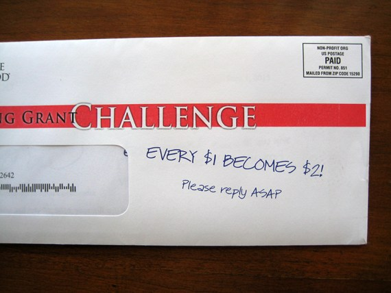
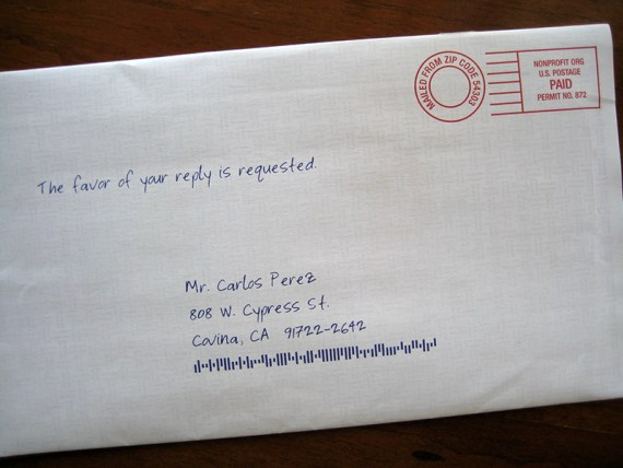
Get personal with good old-timey preprinted handwritten messages
Many people tout the use of personalization technology and how cool it is. But that’s not what I’m referring to. What I mean is adding a static message in handwriting preprinted more economically on the outer envelope.
If done right, you don’t need to pay for personalization technology to make a better envelope. The key is matching well-written tease copy with a very convincing natural font (or even scan someone with good penmanship’s handwritten message) to display as a tease line on the outer envelope. The style of handwriting, imperfections in strokes, the weight and character of the pen or pencil used, and the color of ink all contribute to the overall effect. Cool, low-tech stuff.
Make stress your friend.
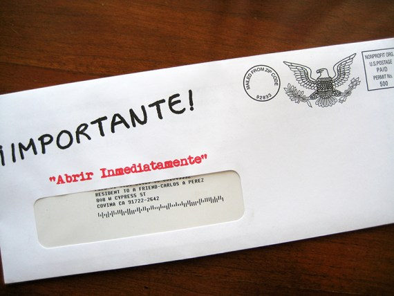
Add urgency embellishment to your envelope. The classic rubber stamped red graphic with “URGENT”, “FINAL NOTICE”, OFFICIAL MAIL: TO BE OPENED BY RECIPIENT ONLY” or similar type of outer envelope graphic can be added at very little production cost.
But here’s my take on this technique based on experience: When you get the person inside, after you’ve raised their blood pressure, you’d better be able to be authentic and consistent inside. If all of a sudden your inside message changes personality from the outer, readers will smell a rat, or should. Don’t be ‘that guy’ who ruins things for the rest of us direct marketers.
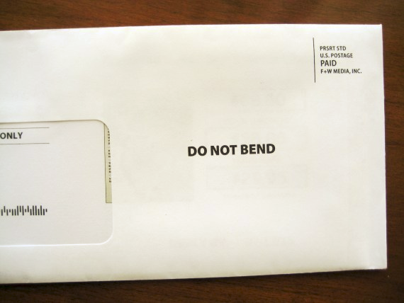
An example of using the stress of compliance. The marketer grabs attention momentarily heightening the importance of this mail with a command of compliance with some unknown rule. All I can say is, it is a technique that works.
Get sticky. Get weird.
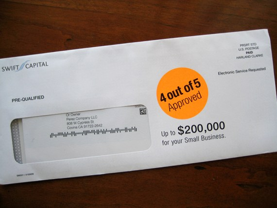
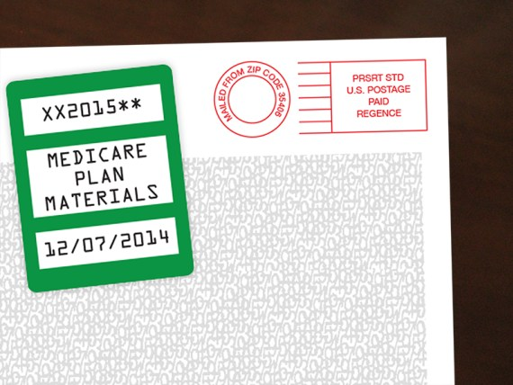
This outer envelope technique adds graphics AND tactile engagement. If you add a “slap dot” or square angled sticker with added special message on the outer envelope, it’s an attention getter that creates curiosity. I have seen direct marketing packages that have what look like orange supermarket code stickers with only numbers and letters in them set at different angles. While I don’t know the ROI, I can tell you I’ve seen the same package and treatment often enough to form the opinion that it works.
Routing info boxes, bar codes, and scrambled eggs
You can add small graphic boxes and areas to the outer that give the impression of special ‘offer codes’ or look like the mail went through some registration or warranted special handling. In addition, the use of black or grey safety/non-read-through patterns (sometimes referred to as ‘scrambled egg’ patterns) create a sense of official packages with confidential information inside.
Don’t forget, you have a second side (almost)
Use the back flap, or rear of the envelope, to add messaging to your envelope. Even on conventional envelopes, there may be enough area on the rear upper flap or panels to support stickers, rubber stamp effect graphics, and more.
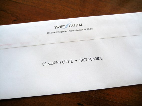
Remember: when people open envelopes, they commonly turn the envelope over. Use the flap, and other space on the back of your envelope, to build more curiosity.
Don’t be bland. Envelopes come in more than just white, and more than just wove finish.
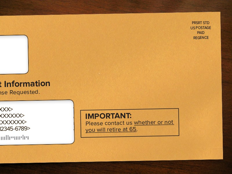
Use a color stock for your envelope instead of white. One of my favorite options to get better envelopes is using manila (kraft) stock envelopes — the color and texture gets attention and looks very serious and official. Envelopes in this stock are widely available. You can also find popular colors that are pastel and bright from a variety of sources.
In addition to color, you can also try different paper stock finishes. If you are looking for a high-end, executive impression in your outer envelope, use a laid, linen or vellum finish envelope.
There’s no reason not to go for better envelopes for your direct mail. Test and test again.
If you already have a baseline ‘control’ package, make little changes, slowly, and conduct testing to see what works best. While there are other factors affecting response, your outer envelope should not be ignored. I’ll repeat it again: the job of the outer envelope is to create curiosity and get the person inside the envelope and in the right frame of mind for what they will find inside. And these eight techniques to create better DM envelopes are valuable, time-tested ways to improve your DM performance.
What do you wish you could change about the outer envelope of your current DM mailings?
This article first appeared on the PerezWorks blog.
Carlos Perez, Creative Director, Beasley Direct & Online Marketing, Inc.
 Carlos Perez has 28 year’s experience as an advertising art and creative director, with more than a decade concentrating on direct marketing and branding. Carlos Perez enjoys working on both general and direct creative projects, and he frequently acts as a consultant on the marketing strategy development team. His clients have ranged from automotive and financial to hi-tech, including American Isuzu Motors, Bank of America, CitiFinancial, Diners Club, eHealthInsurance.com, Intuit, Microsoft, Network Associates, Pacific Bell, Southern California Edison, 3Com, United Airlines, and CBS Television. Carlos has worked for major general and direct response advertising agencies including Grey Advertising, Brierley & Partners, Bates Worldwide Advertising and J. Walter Thompson Recruitment Advertising.


Very good blog post. I definitely appreciate this website. Keep it up!
Thank You !!
I will share your site.
Oh, this is really interesting and new information for me, very good article!